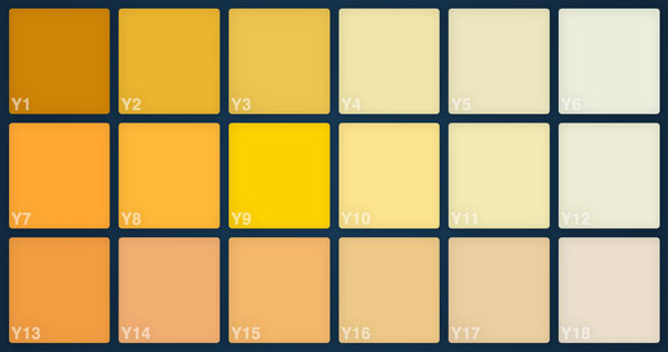
I've created this colour chart to provide a meaningful way for artists to compare colours from a range of nearly 400 colours.
The aim is to add interactivity that will allow side by side colour comparison of a range of user selected colours. It's currently built with Flexbox, but I do have a Grid version, but need to work fallback into it. I would also like to put texture into the colour tiles, to mimic a drawn out pastel. I did have a gif texture (created from a photo) blended in, but again, that's not compabtible with a lot of browsers, so removed until I figure out a different way of doing it.
There is currently a rudimentary button set at the bottom of the chart which will switch between light and dark backgrounds. I fully expected the light background to suit the dark colour tiles, but what I've found is the opposite. It produces too much glare to be able to distiguish the subtle differences in the dark colour sets. Paradoxically, it turns out that the light background better suits the light colours tiles.
Typically, in print, the best background is white, as the colours stand out the most. Web design is a diferent animal.

This is my business website, built as a simple static site.
I build websites for local businesses and organisations, and build mostly using Joomla!.